How to optimise to get more conversion? (Example)
Recently, I ran into some trouble with investing in US stocks through the INDMoney app, thanks to a pesky bank issue. But last week, things took a turn for the better when the issue was finally resolved. This got me thinking about whether I should dive back into US stocks or hold off for a bit.
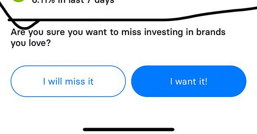
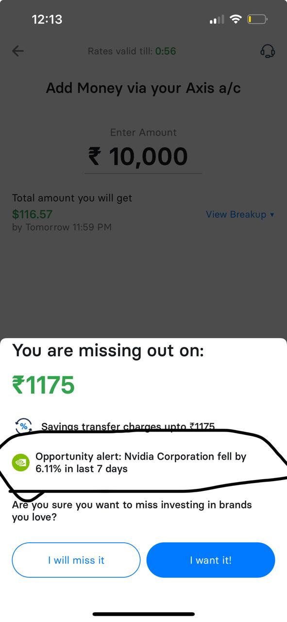
I decided to open the INDMoney app just to see how things were looking. I was casually browsing, not fully decided on adding more funds. But then, something small but powerful caught my attention. As I hit the 'add money' button, a new message popped up on the screen, a simple yet impactful piece of information: NVIDIA's stock had dipped by a significant percentage, signaling a potentially great buying opportunity.
This tiny piece of timely data changed everything for me. It wasn't just any message; it was directly relevant to the investment decision at hand. The insight that NVIDIA was now more affordable acted as a decisive nudge, leading me to immediately top up my account and consider buying NVIDIA shares.
This experience was a brilliant reminder of how crucial UX can be in conversion rate optimization. Just one well-placed piece of information can transform hesitation into action, turning a routine interaction into a significant financial decision.
It's moments like these that underline the value of thoughtful design and user-centric features in apps. These aren’t just about making things look good—they're about making them work effectively, enhancing decision-making, and, ultimately, improving user satisfaction.
If you liked this newsletter, forward it to your one friend who loves marketing :)


