


The best package design idea of recent times?

You know that feeling when you're strolling through the aisles of a supermarket, your marketing radar buzzing like crazy? That's me on most of my weekend shopping trips. I'm always on the lookout for something new, something that grabs my attention – whether it's a unique packaging design, an offbeat color scheme, or some clever copy that makes me chuckle.
But this time, it was the complete opposite. My eyes locked onto something unexpected – Kellogg's cereal boxes that were, well, black and white. Yep, you read that right. In a sea of vibrant, colorful cereal boxes, Kellogg's decided to go grayscale.
Take a look for yourself:
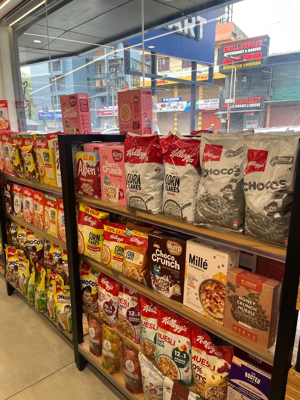
Now, I'm no design expert, but I have to say, it's bold. When everyone else was throwing a rainbow of colors on their packaging, Kellogg's took a different route. No fancy gradients, no flashy imagery, just black and white.
And you know what? It works. Amidst all the visual noise, this stripped-down approach made me stop and take notice. It's like Kellogg's is saying, "We don't need a riot of colors to stand out."
Major props to the team behind this move. It takes some serious guts to test such a bold hypothesis, especially for a brand as iconic as Kellogg's.